This was a rebrand project for the Illinois Science Council, which is an organization who organizes and promotes science events for adults in the Chicago area. For this project, I worked on a team with three other designers create a new and engaging brand identity for our client.
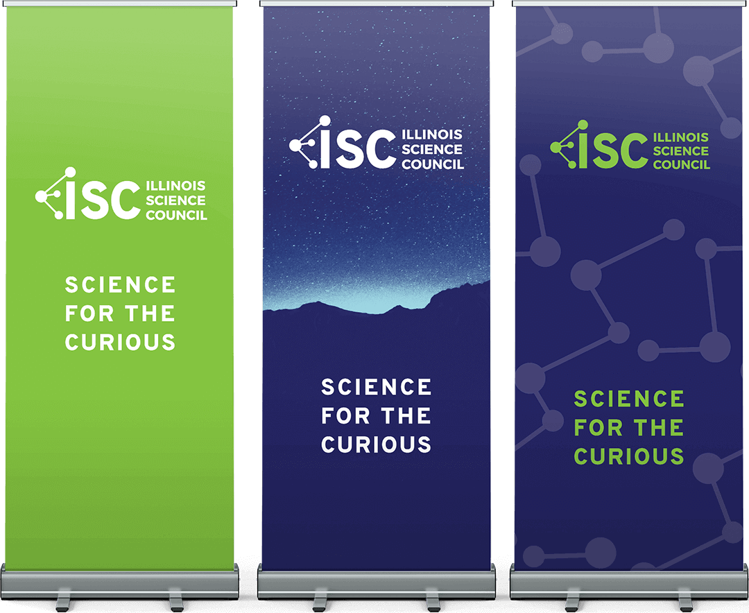
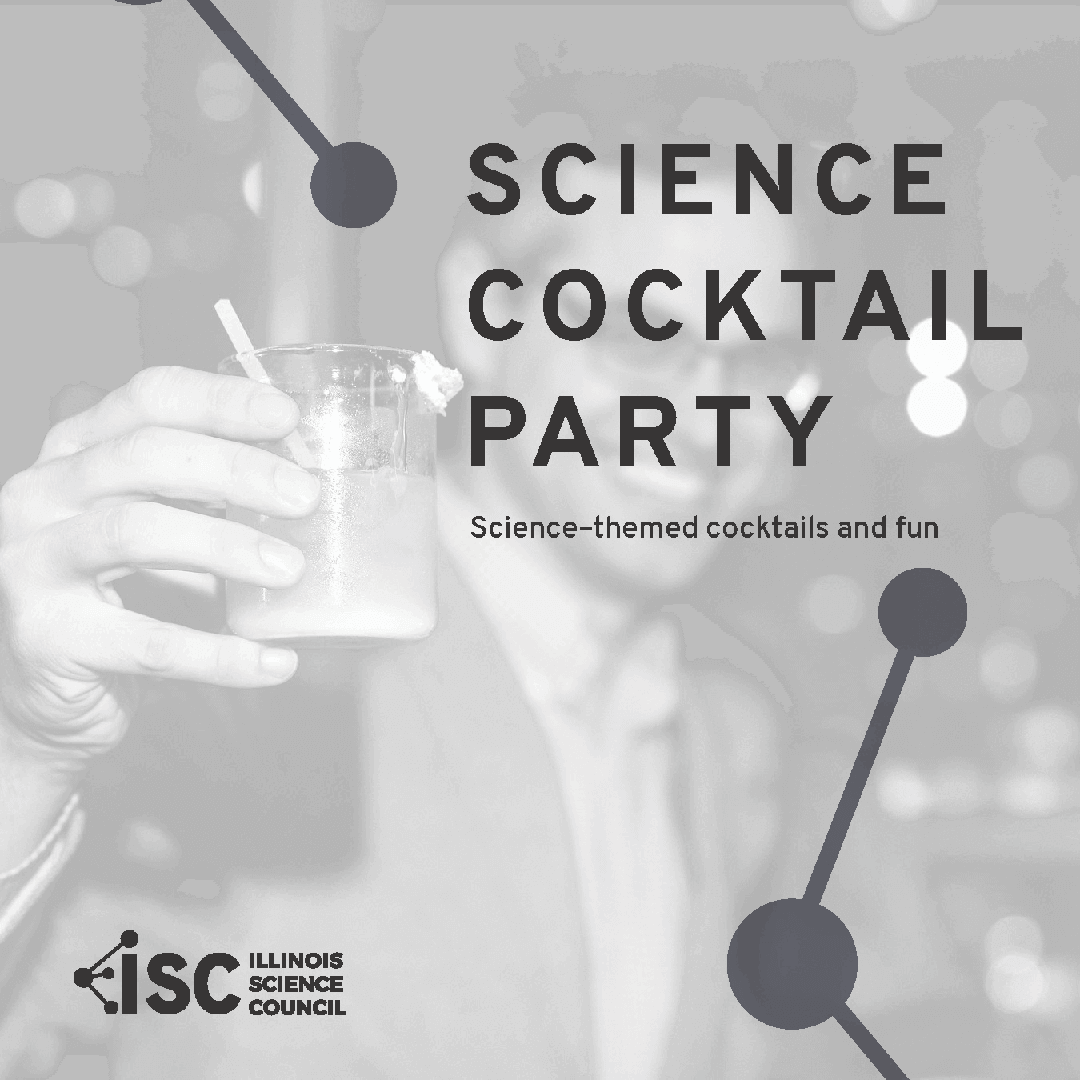
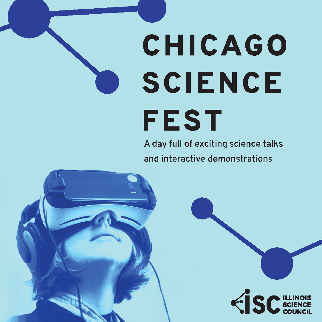
This logo was designed to represent science in a way that kept elements of the original logo, yet looked more modern. The connected balls and lines represents a molecule integrated into the letterforms.
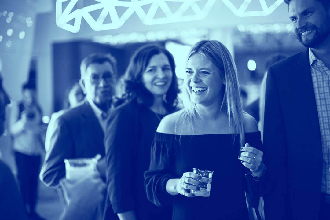
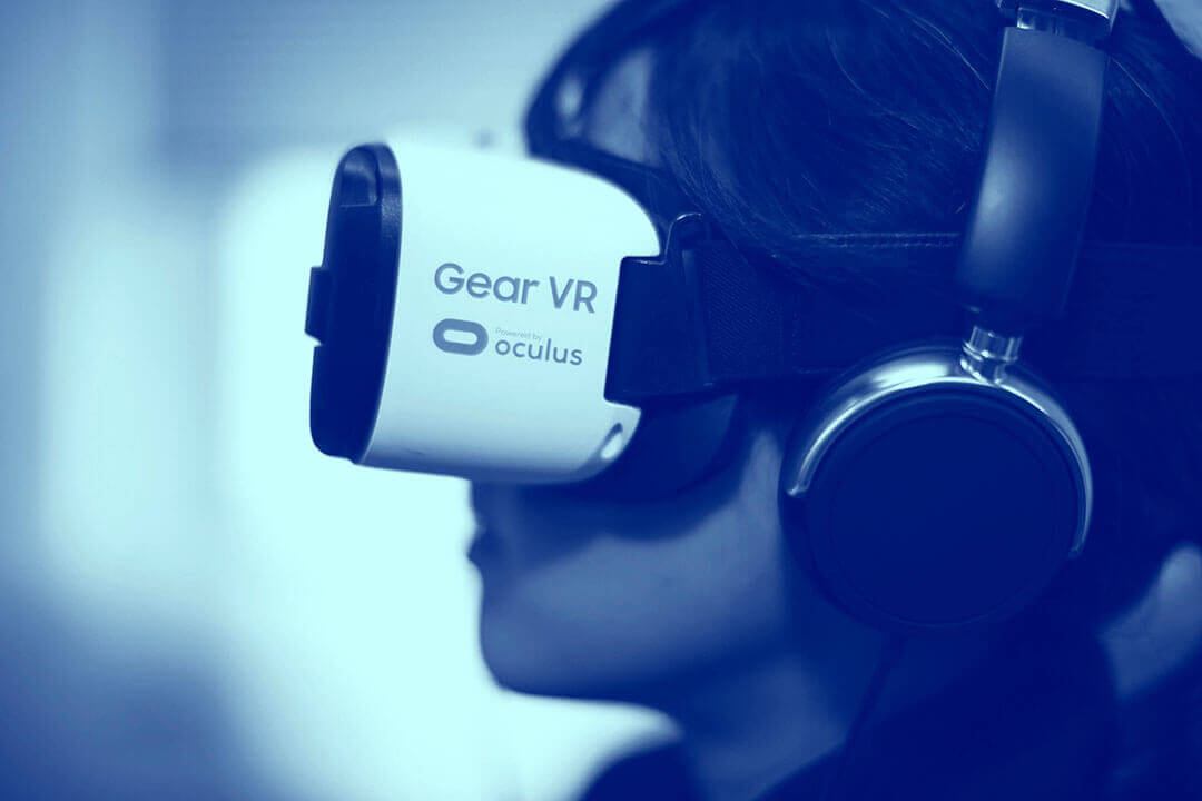
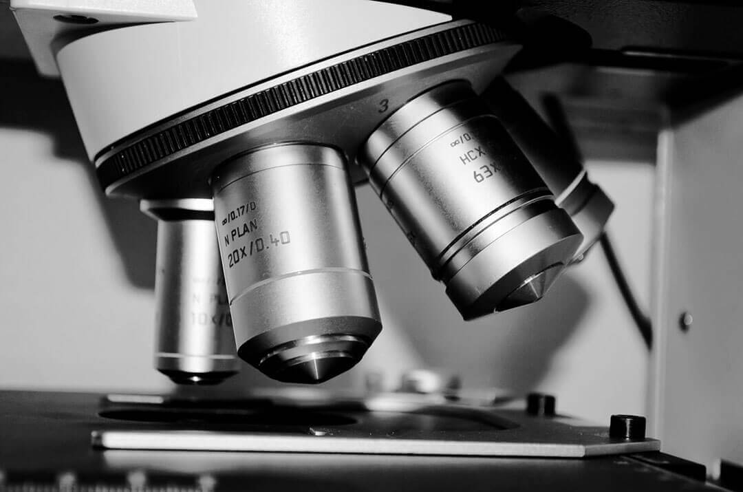
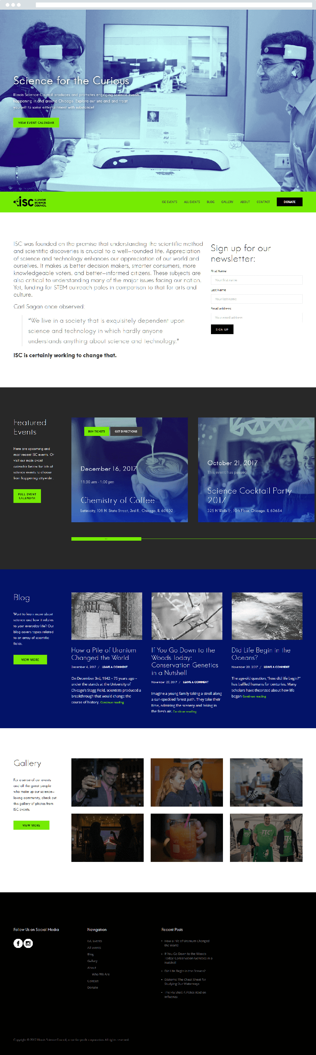
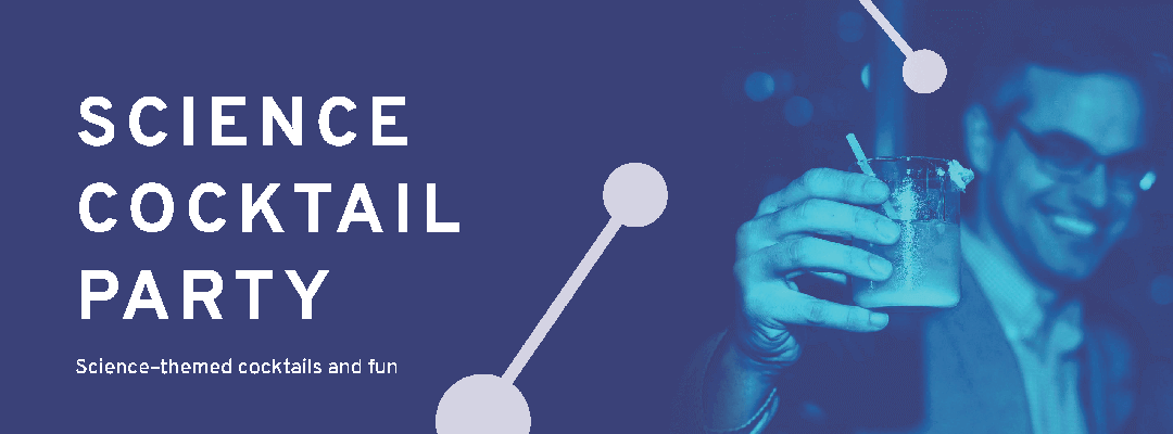
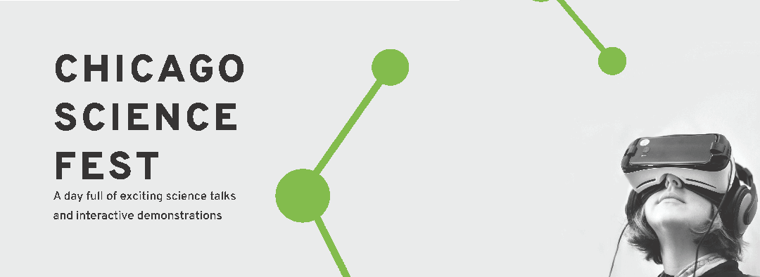
All photographs in this rebrand use one of two consistent treatments. My team created a gradient map that uses a contrasting color to the logo to be used on event photos. This specific color was chosen so the subjects would still be clearly visible and un-distorted. A black & white treatment was used to make photos across all blog posts consistent.

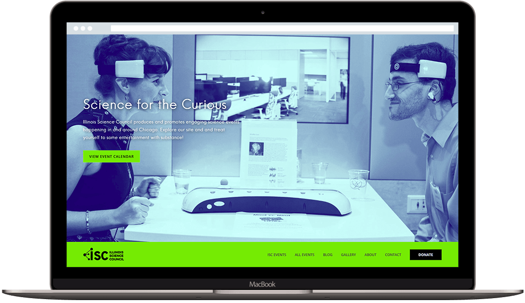
This revamped website was built using Wordpress. When designing the site, my team tried to make the experience of visiting the site as intuitive and easy to understand as possible.
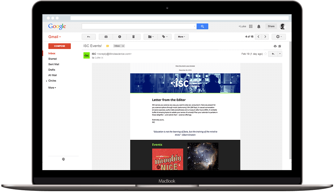
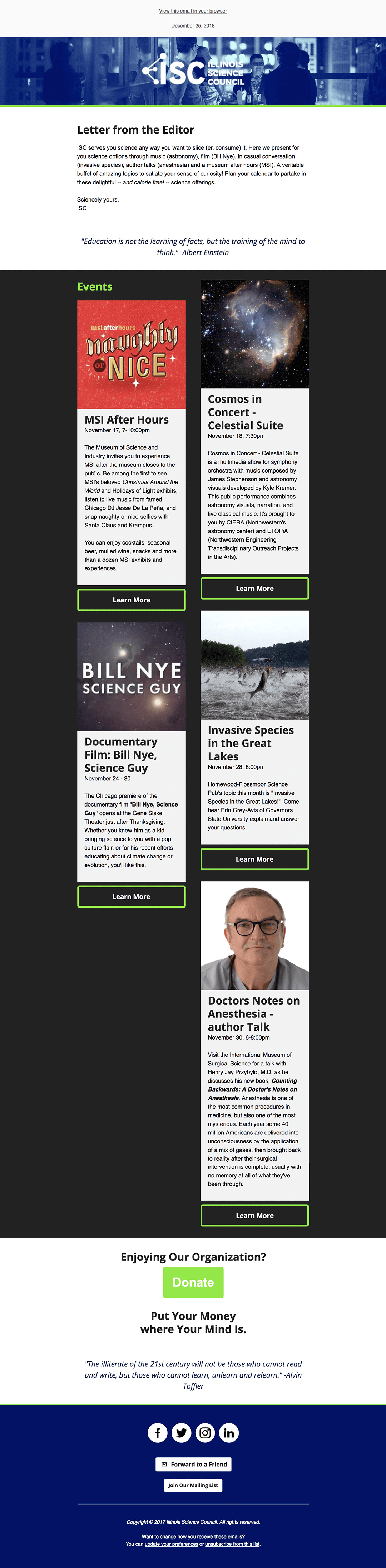
The newsletter is mostly being used to inform people about the upcoming science events. We placed each event on cards that will flow down the page. As a non-profit organization, the donate call to action is important to have prominence.
We created cohesive social media promotions to be posted on each platform.
The retractable banners are used during events and science talks hosted on by the Illinois Science Council.